
Mobile-First UI/UX

Doris Infotech
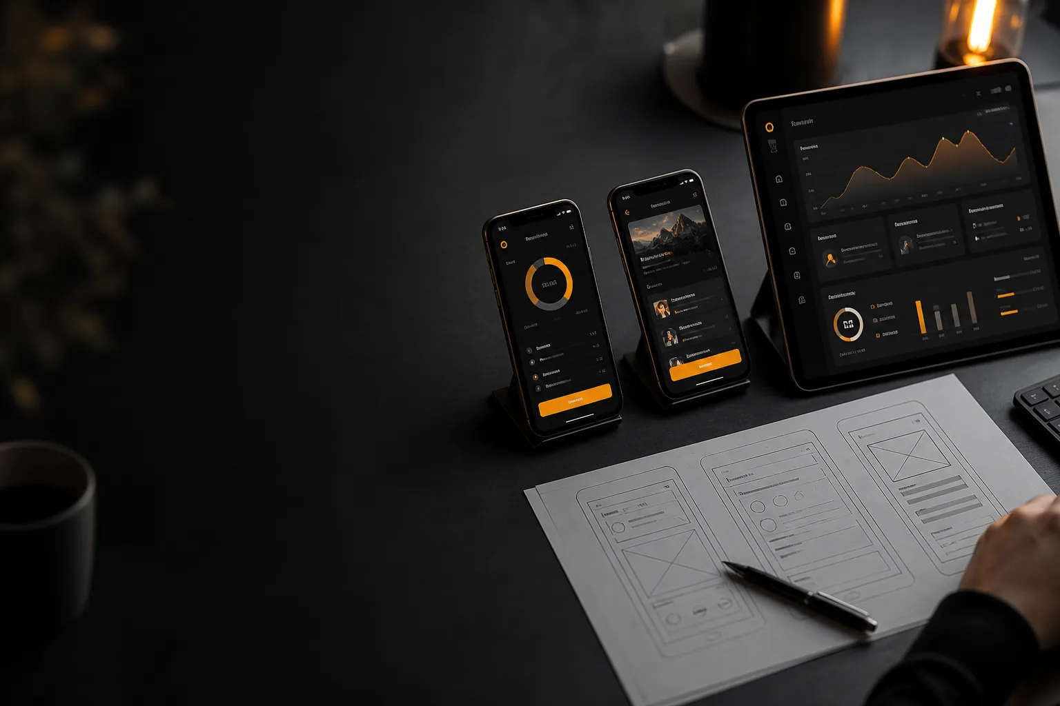
If a product only looks finished on a wide monitor, it is not finished. Most people open software on a phone: between meetings, on the shop floor, or on the way to work. Thumb reach, small type, and slow networks decide whether they stay or leave.
Mobile-first UI/UX does not mean shrinking a desktop layout. It means designing the core task for one hand, one screen, and one clear action. Then you add space, secondary tools, and richer layouts as the viewport grows.
At Doris Infotech we start with the smallest useful screen. If the flow works there, tablet and laptop versions become expansions of a strong idea instead of rescue jobs for a crowded desktop mockup.
Design the primary task for one thumb
Put the main action where a thumb can reach it. Keep navigation short. Avoid tiny links stacked at the top of the screen. A mobile-first product asks one question per view whenever it can: what should the user do now? Extra options belong in a menu, not in the first glance.
Type, tap targets, and real content
Body text that looks fine on a 27-inch display often fails on a 375-pixel phone. Use sizes that stay readable without pinch-zoom. Buttons and inputs need enough height for a finger, not a cursor. Design with real labels, real errors, and real empty states so the layout does not break when content is longer than the lorem ipsum in the file.
Progressive layout, not a squeezed desktop
Scale up in steps: phone, large phone, tablet, laptop, desktop. Two columns can wait until there is enough width. Three columns belong on laptop and up. If you start with a 1440-pixel grid and compress it, users inherit clutter. If you start with a single column and reveal structure as space appears, the product stays calm on every device.
Performance is part of the experience
A beautiful screen that takes four seconds to appear feels broken. Compress images, avoid heavy animation on low-end phones, and show loading states that explain what is happening. Mobile-first UX includes the wait, the error, and the offline moment - not only the perfect happy path.
Test on real devices before you ship
Browser resize is a start, not a finish. Hold the phone. Try it one-handed. Check landscape. Ask someone who did not design it to complete the main task. Friction you cannot see in Figma shows up immediately on glass. We treat that check as part of delivery, not a nice-to-have at the end.