
UI/UX Design That Converts

Doris Infotech
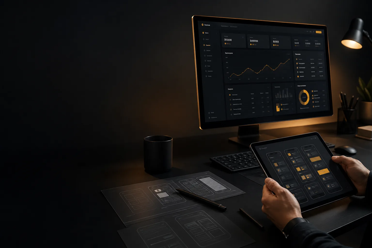
A product can be technically complete and still fail. Users bounce when screens feel confusing, forms feel endless, or they cannot tell what to do next. That is not a coding problem first. It is a UI/UX problem.
At Doris Infotech, we treat design as part of product delivery, not a coat of paint at the end. UI is what people see: layout, type, color, controls, and visual hierarchy. UX is what people feel: how quickly they understand the product, complete a task, and come back without help.
When both are done well, software feels obvious. Customers need fewer support calls. Teams ship fewer redesigns. The product earns trust in the first few minutes, which is usually all the time a new user will give you.
Start with the user, not the screen
Before a wireframe, map who the product is for and what they must accomplish. A founder, an operations manager, and a first-time customer do not need the same dashboard. Interview real users, list their jobs-to-be-done, and design the shortest path to those outcomes. Screens should follow that path, not the other way around.
Hierarchy, flow, and clarity
People scan. They do not read every label. Strong UI/UX uses size, contrast, spacing, and placement to show what matters now. Primary actions should be obvious. Secondary actions should stay available without competing. Navigation should answer three questions on every page: where am I, what can I do, and how do I get back.
Consistency, accessibility, and trust
Buttons that look the same should behave the same. Color should never be the only way to communicate status. Text must stay readable on dark and light surfaces, tap targets must be large enough on mobile, and forms should explain errors in plain language. Accessibility is not extra polish. It is how a product stays usable for more people and feels more professional to everyone.
Prototype, test, then ship
Guessing is expensive. A clickable prototype, even a simple one, reveals dead ends before engineering builds them. Watch five users try a core task. If three of them hesitate on the same step, the design is not ready. Test early, fix the friction, then build. That loop saves time on every product we design and develop.
Design and engineering as one team
Beautiful mockups that cannot be implemented help nobody. The strongest products come from designers and developers sharing constraints: performance, edge cases, empty states, loading, and real content. When UI/UX and engineering work together from the first sprint, the shipped product matches the intended experience instead of a compromise made too late.